payment kiosk UI design
A payment-ready checkout moment inside a tablet ordering journey built to feel calm, obvious, and recoverable in B2B environments.
00
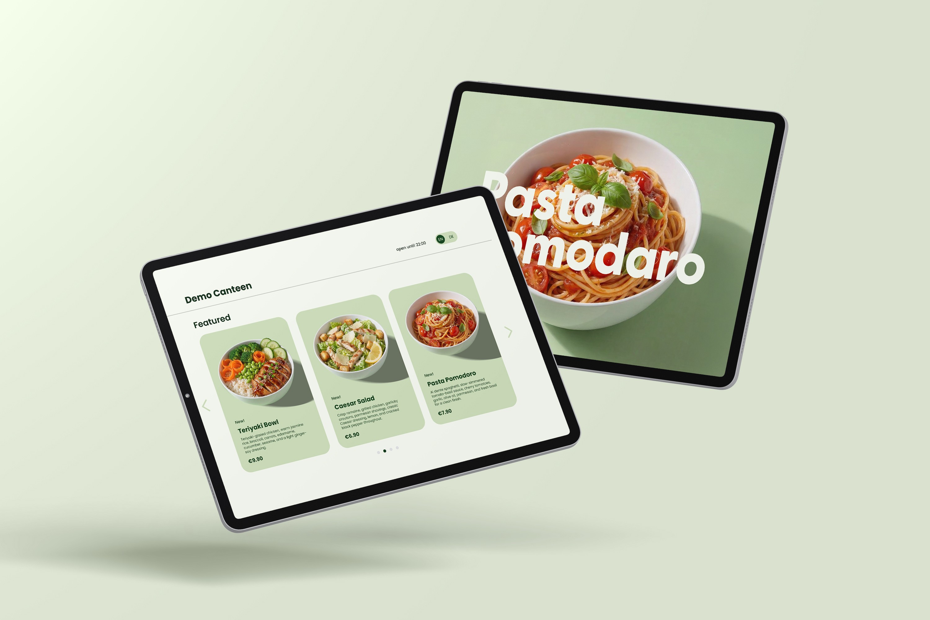
I designed a tablet based payment experience for a shared B2B ordering kiosk, where checkout is a high-pressure moment (queues, shared device, hardware/network friction).
My focus was making payment feel calm, obvious, and recoverable including failure states (declines, retries, cancellations) as first-class flows.
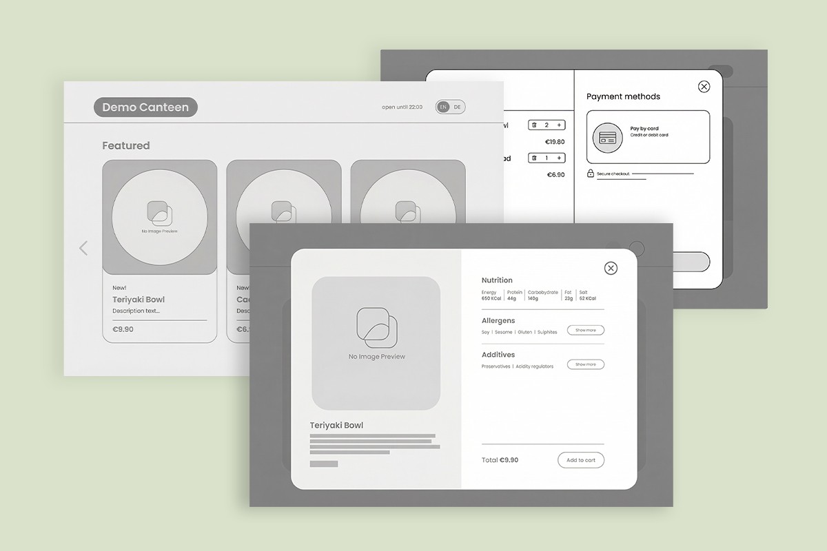
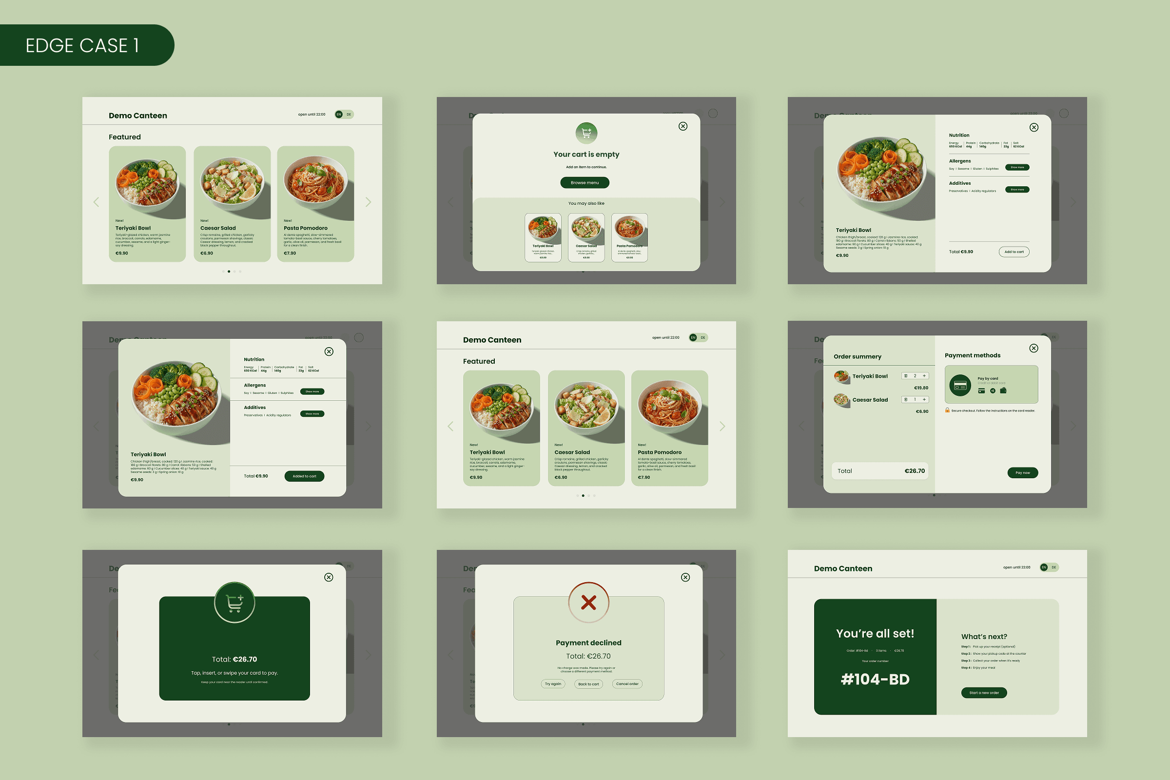
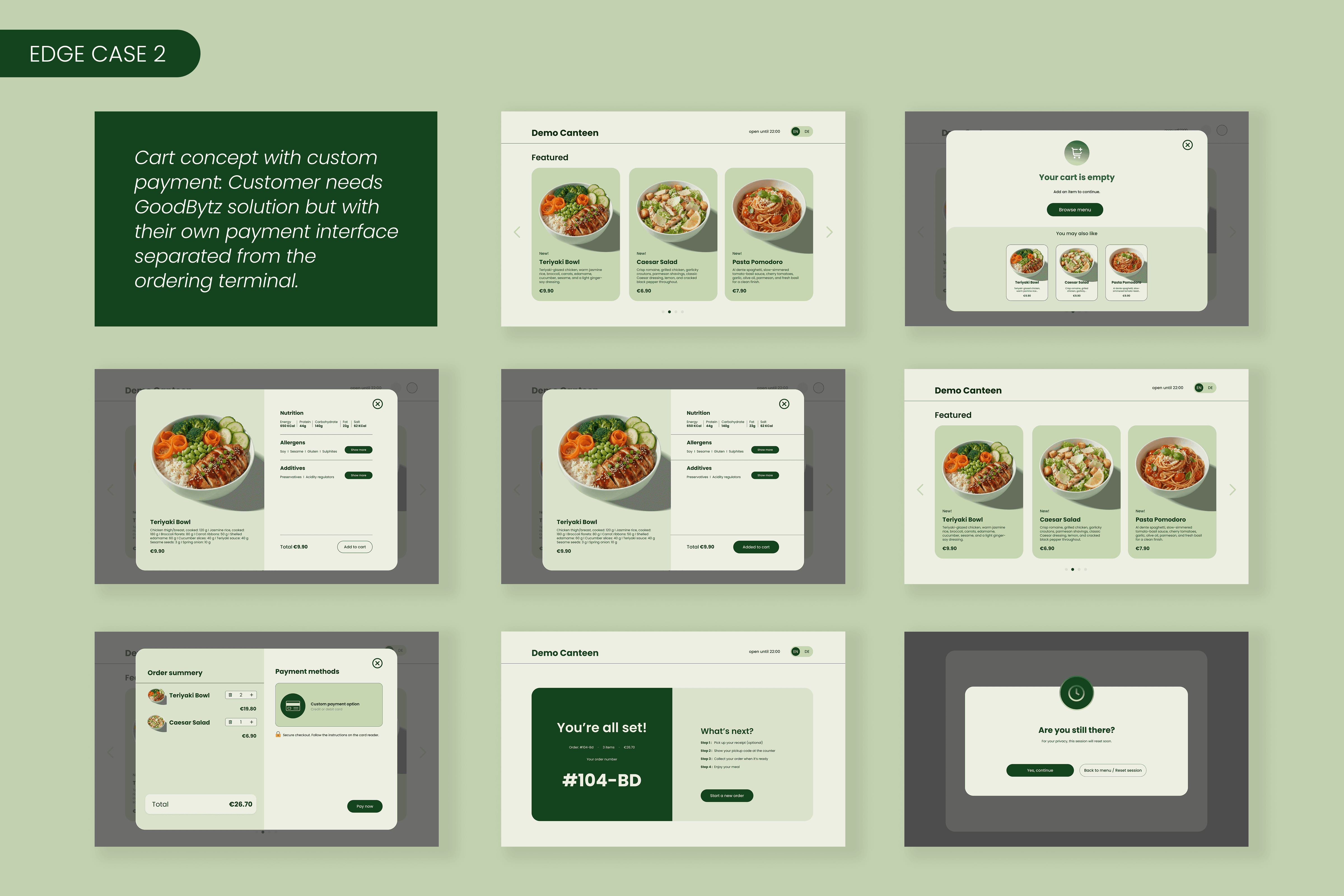
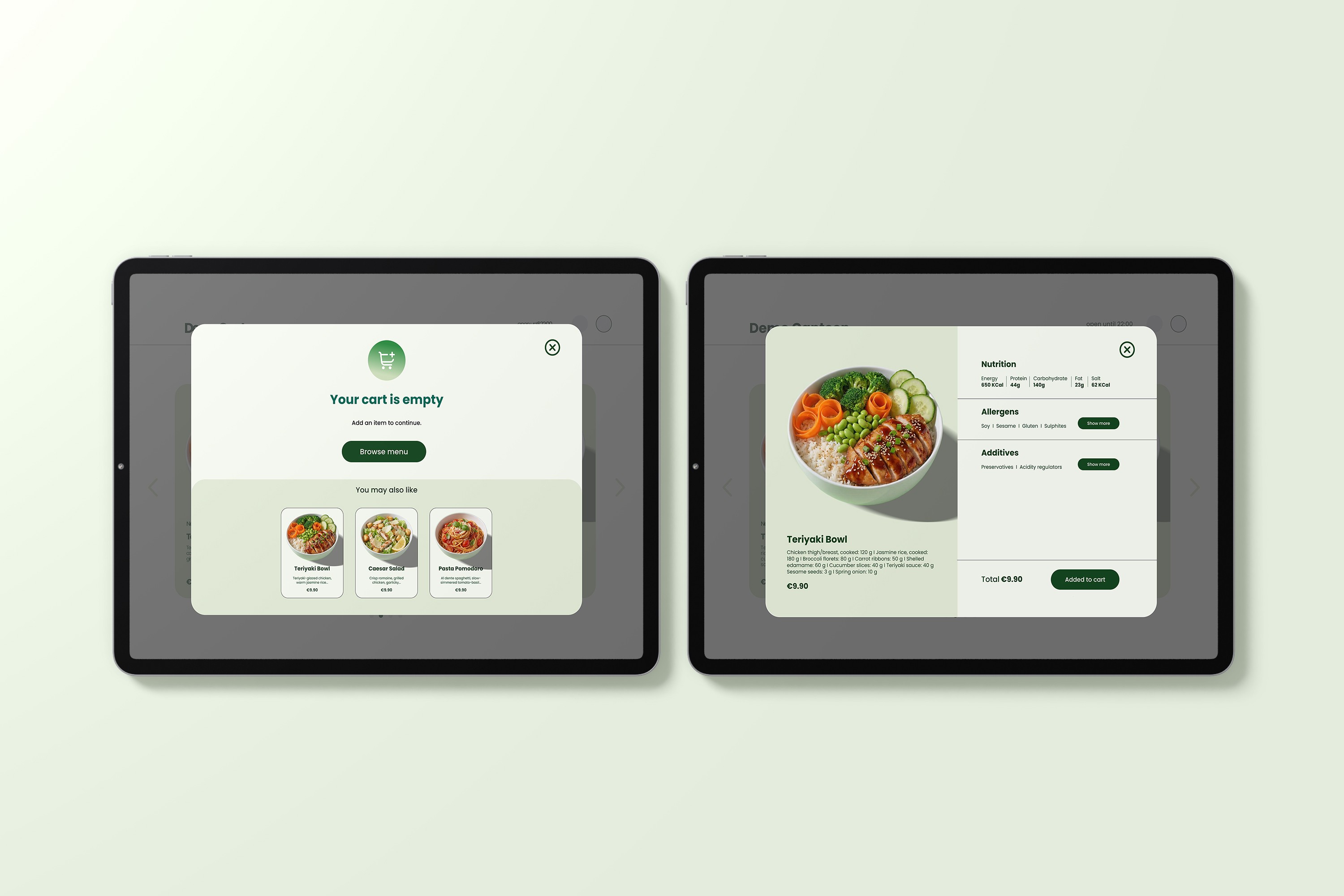
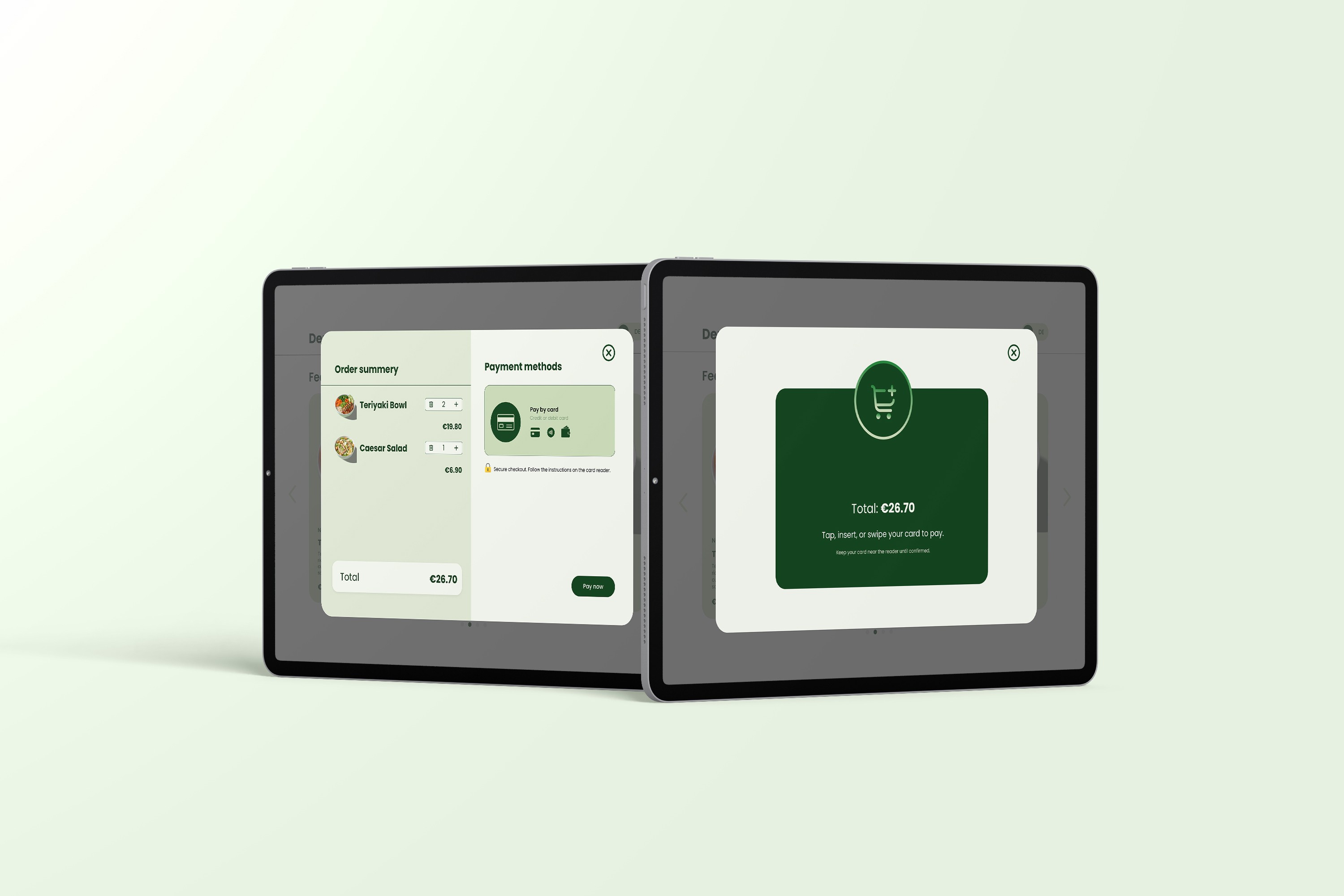
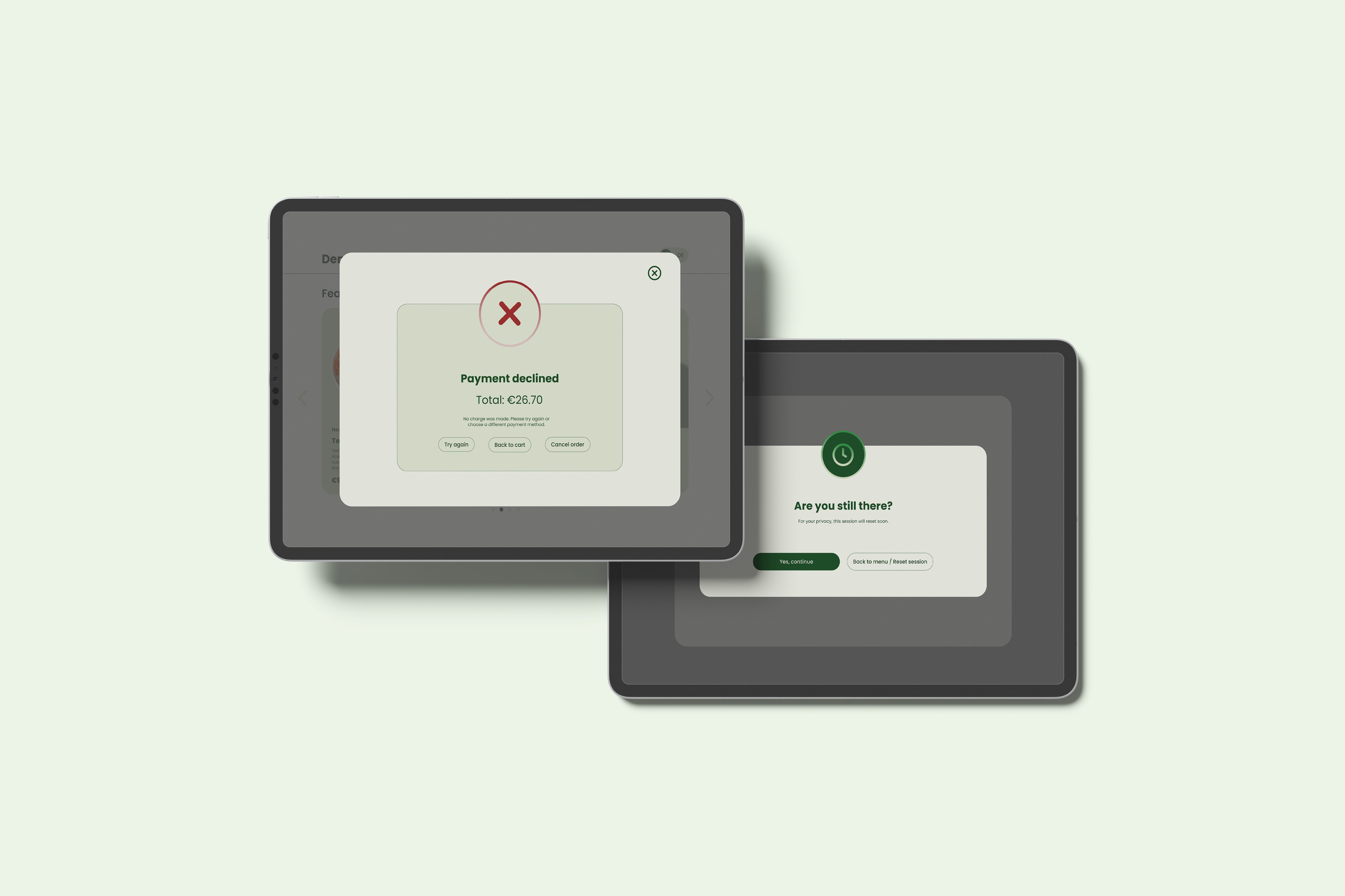
I delivered a payment-ready checkout moment within the ordering journey: review → choose method → card-present instruction → success/failure recovery → operational handoff.
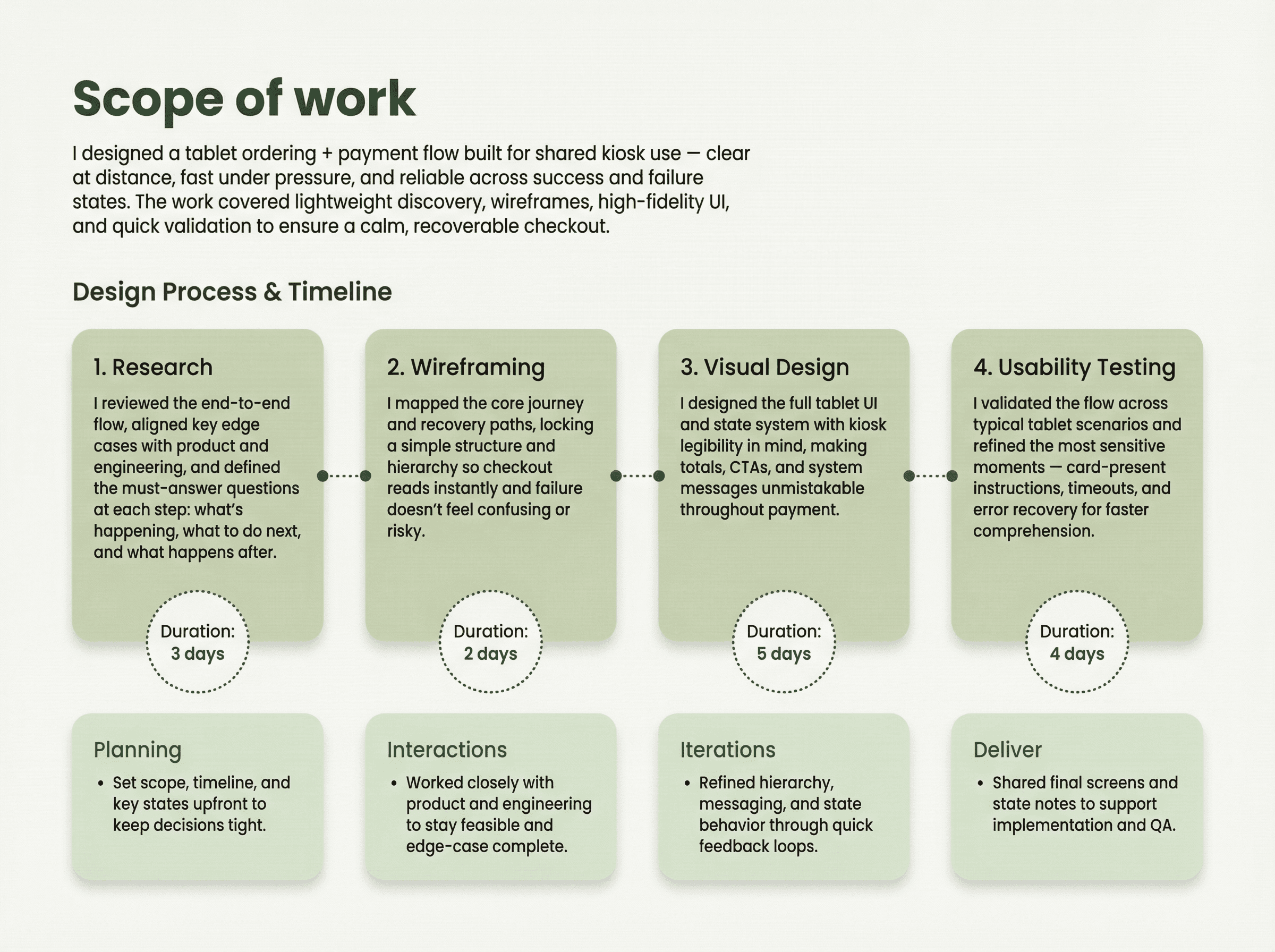
I aligned quickly with product and engineering on device constraints and key edge cases, audited the current flow for confusion and dead ends, and scanned comparable kiosk patterns for card-present, declines, and recovery.
Key insights:
A few insights shaped the solution. The biggest one was that uncertainty drives drop-off, especially the question ‘Was I charged?’. Another was that card-present moments need the UI to be quieter and more signage-like, because users are physically interacting with the reader, not reading lots of interface text. And because it’s a shared device, mistakes are more likely, so recovery paths need to feel very safe and clear.
Design principles derived from insights:
I built the flow around three principles: unmissable status, one dominant action per step, and humane recovery with clear exits. In practice, that meant every screen had to answer three questions very quickly: what’s happening, what do I do now, and what happens next.
role
UI Designer
timeframe
10 days
tools
Figma
category
Product UI
year
2025
problem
The core problem was that payment friction creates both emotional and operational risk. Users worry about whether they were charged after a decline, too many options or competing CTAs slow them down, and without clear guidance at the reader, people hesitate. Even after success, users can still be unsure what happens next in the pickup process.
solution
I designed the flow to feel calm and inevitable through a clear step-by-step rhythm and one dominant action per screen. A dedicated card-present instruction state keeps the UI quiet during the physical payment moment, while the failure state explicitly reassures “You weren’t charged” and offers safe exits. Payment methods are grouped under a single “Pay by card” choice to reduce decision load, and the success screen includes an operational checklist (receipt → QR → pickup) to bridge digital confirmation to real-world handoff.
01
02
03
04
05
06
07
08

see also