eatFit “big 5”
A transparency-first campaign system designed to lift awareness, drive installs, and build “health credibility” at a glance.
00
Context
EatFit needed to lift awareness and drive app installs among a 25–40 urban professional audience who'd stopped believing wellness marketing dressed up in glossy photography and soft claims.
Insight
This audience doesn't trust a brand for what it promises. It trusts a brand for what it visibly refuses to do. A soft wellness claim reads as marketing. A hard exclusion rule reads as proof.
Concept
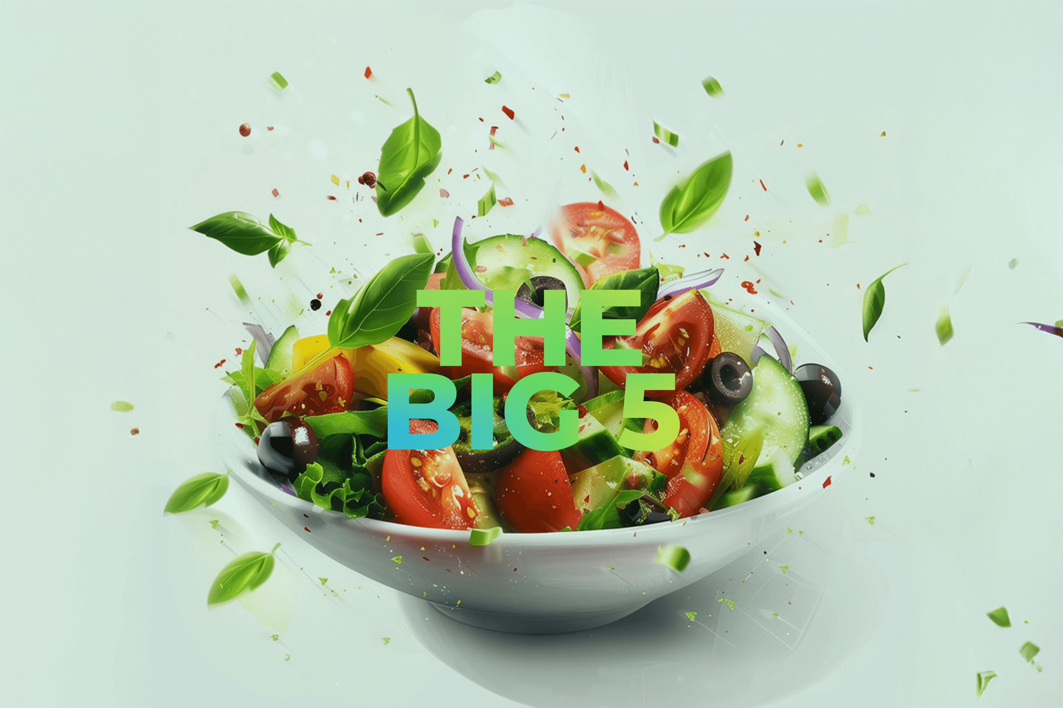
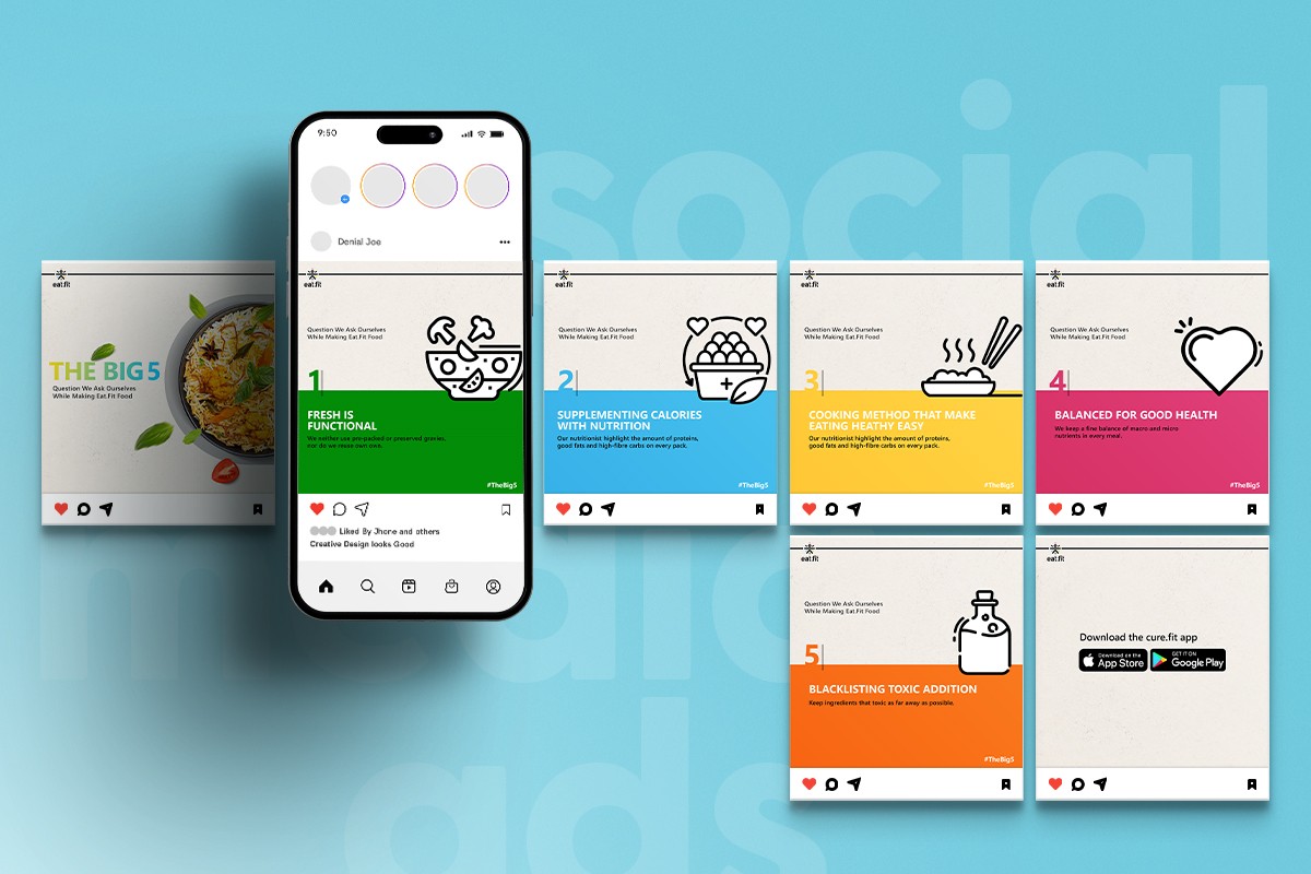
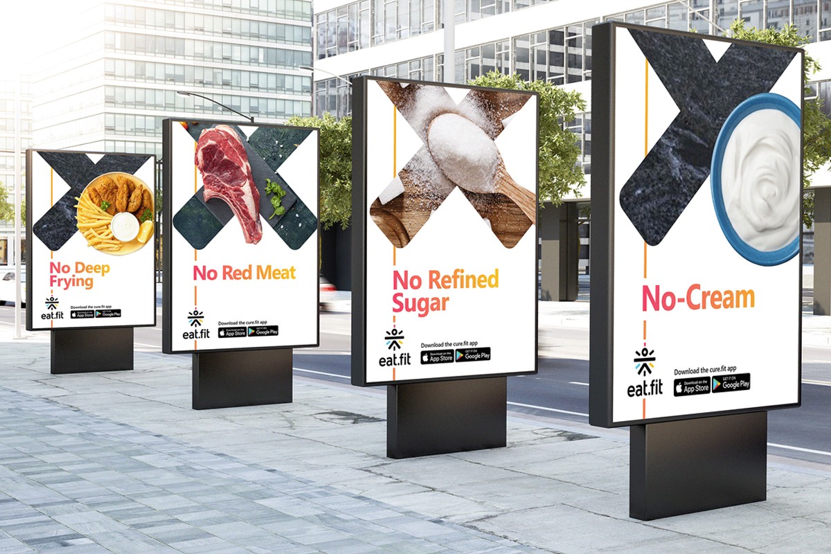
Five black-and-white exclusion rules, not five soft claims: no cream, no refined sugar, no red meat, no deep frying, no dependency-driving ingredients. Credibility comes from what's kept out, not what's promised.
System
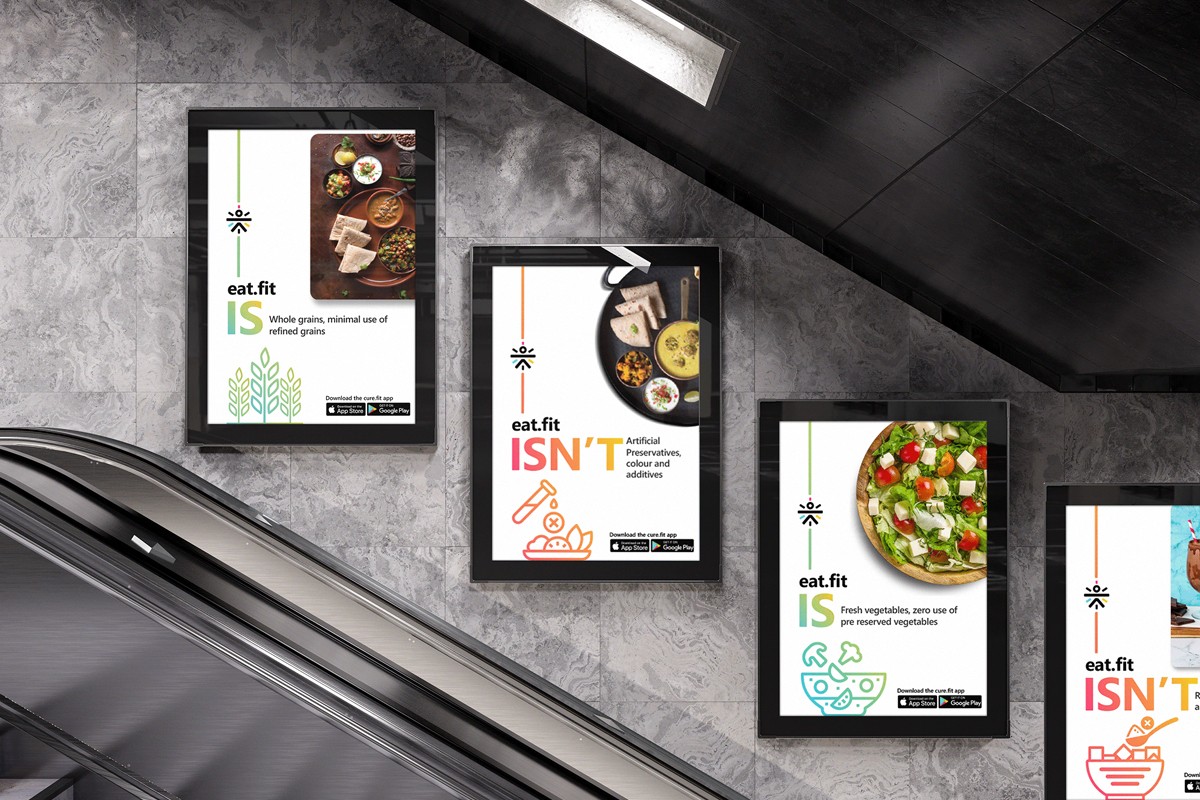
Every touchpoint runs the same exclusion logic: a hero food circle, an IS/ISN'T contrast layout, a bold "No ___" proof device with an X-overlay, one icon row, one CTA zone. Swap the channel and the rule still reads the same.
Application
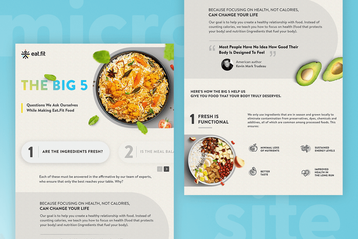
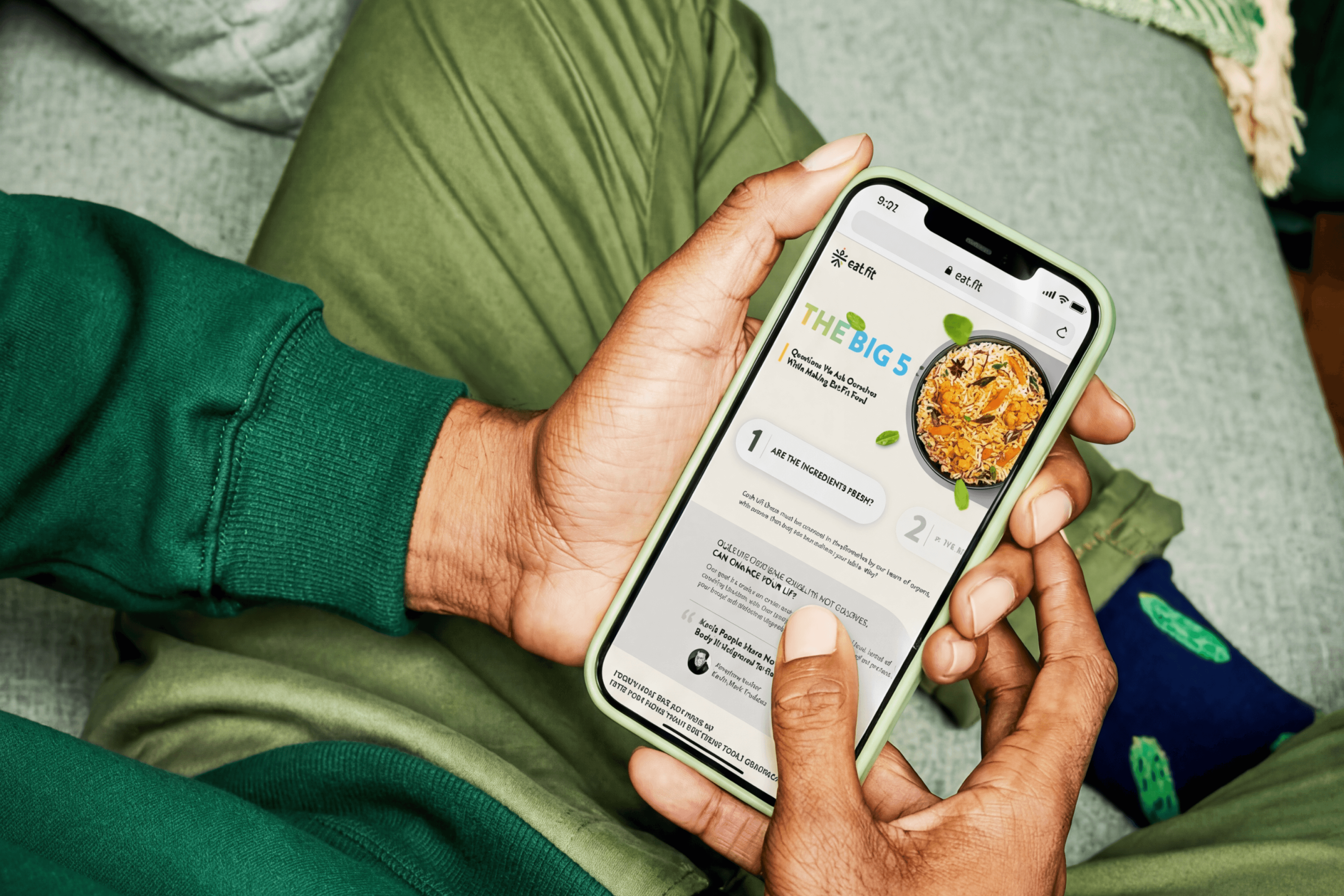
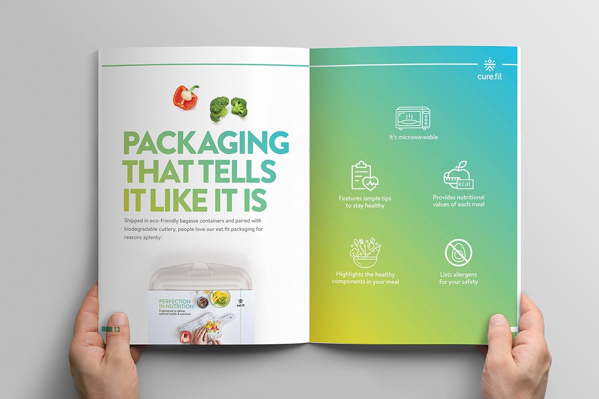
That rule system had to survive a three-second OOH glance and a full brochure page without softening, so the rollout ran one logic end to end: hook on OOH and social, explain on the microsite, reinforce through brochure and packaging, convert on the app CTA.
Outcome
The "No ___" visual (the bold graphic showing what EatFit leaves out of its food) kept getting used even after the campaign officially ended. It wasn't a one-time asset, it stuck around. Sales and marketing kept using the Big 5 graphic in pitch decks and client meetings for weeks after launch, unprompted. App installs rose 19% over the following quarter.

Hook (OOH/social) with contrast + exclusions → Explain (microsite) with the Big 5 framework → Reinforce (print/packaging) so transparency becomes tangible → Convert (app CTA) when people are ready to act.
role
Art Direction, Creative direction
timeframe
14 days
tools
Adobe Illustrator & Photoshop
category
Campaign System
year
2020
01
02
03
04

05
06
07
see also