art13 identity system
A brand identity system for ART13, a rotating culinary concept space inside GoodBytz.
00
Context
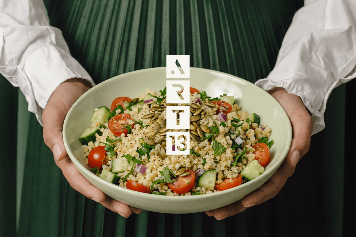
ART13 is a culinary experience space inside GoodBytz's ecosystem. Sometimes an internal concept, sometimes a collaboration. The menu changes like a curated drop. Guests return and find a new journey each time.
Insight
The brief wasn't "design a logo for a restaurant." It needed to read as one coherent, trustworthy brand no matter what was on the menu that month. Too generic and it's forgettable. Too specific and it breaks the moment the concept changes. That tension was the real design problem.
Concept
I treated the brand like an exhibition identity. The food is the artwork. The menu changes like a curated drop. The design system stays quiet in the background.
System
I anchored the brand in six attributes: artistic, futuristic, elegant, natural, curious, minimal. One rule: every visual decision had to trace back to one of them, or it didn't belong. That turned this into a toolkit, not just a logo.
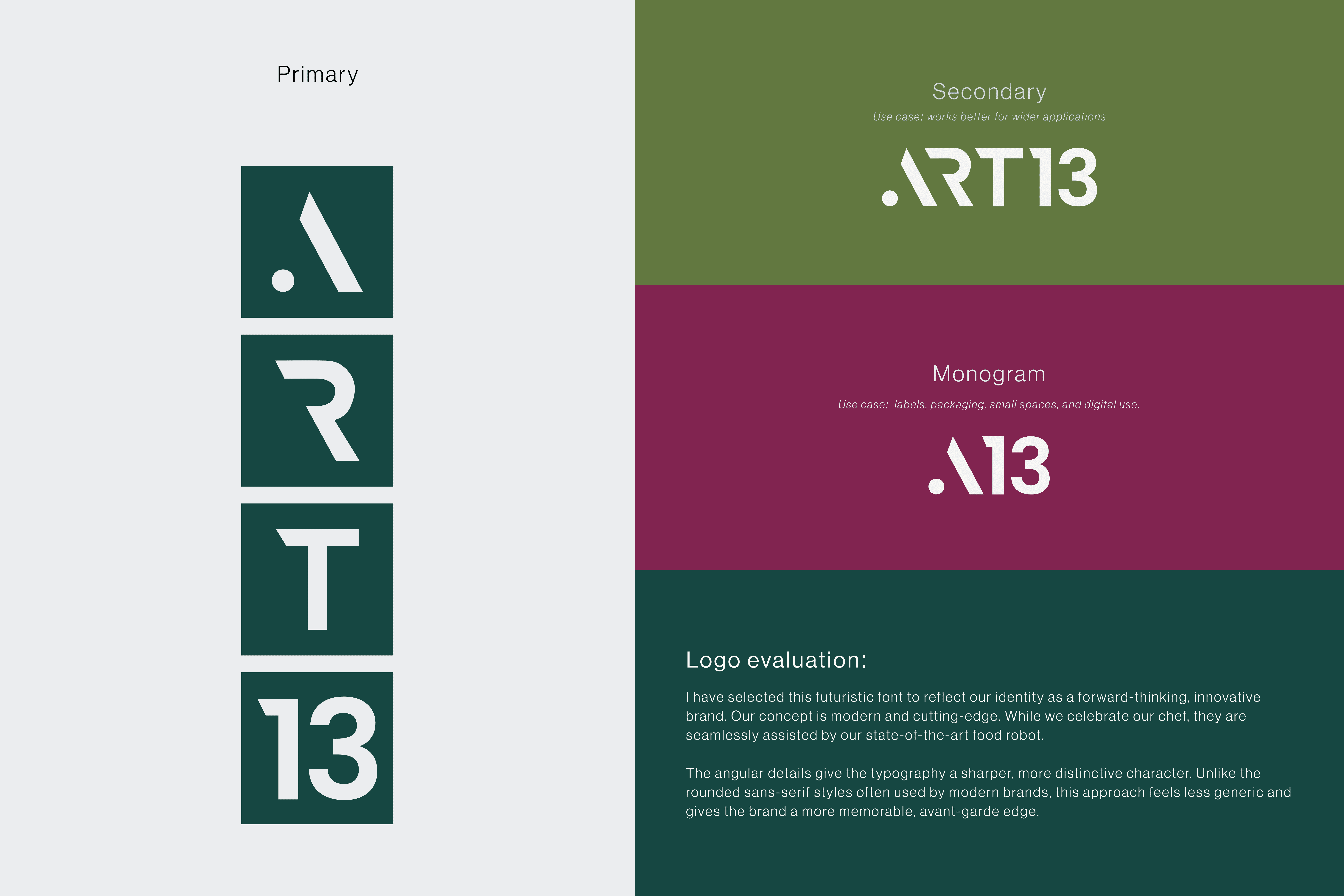
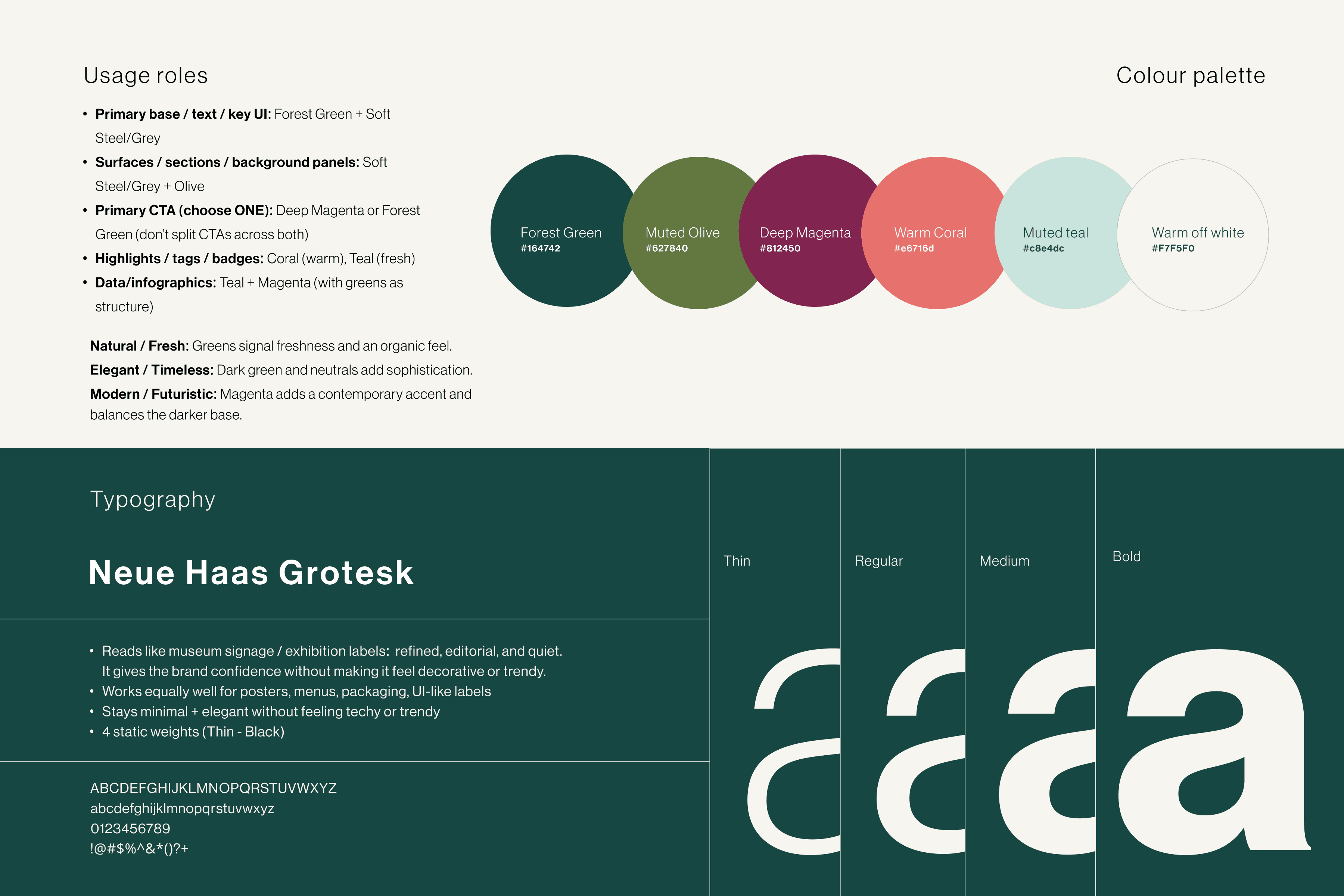
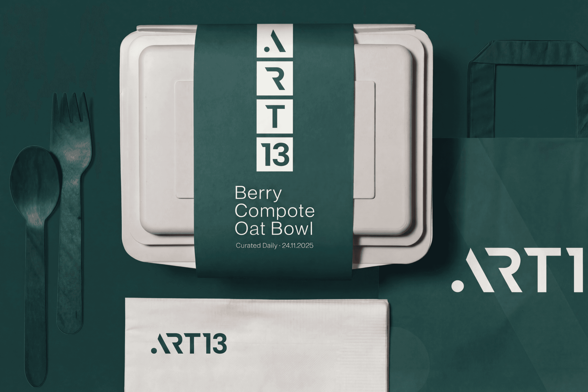
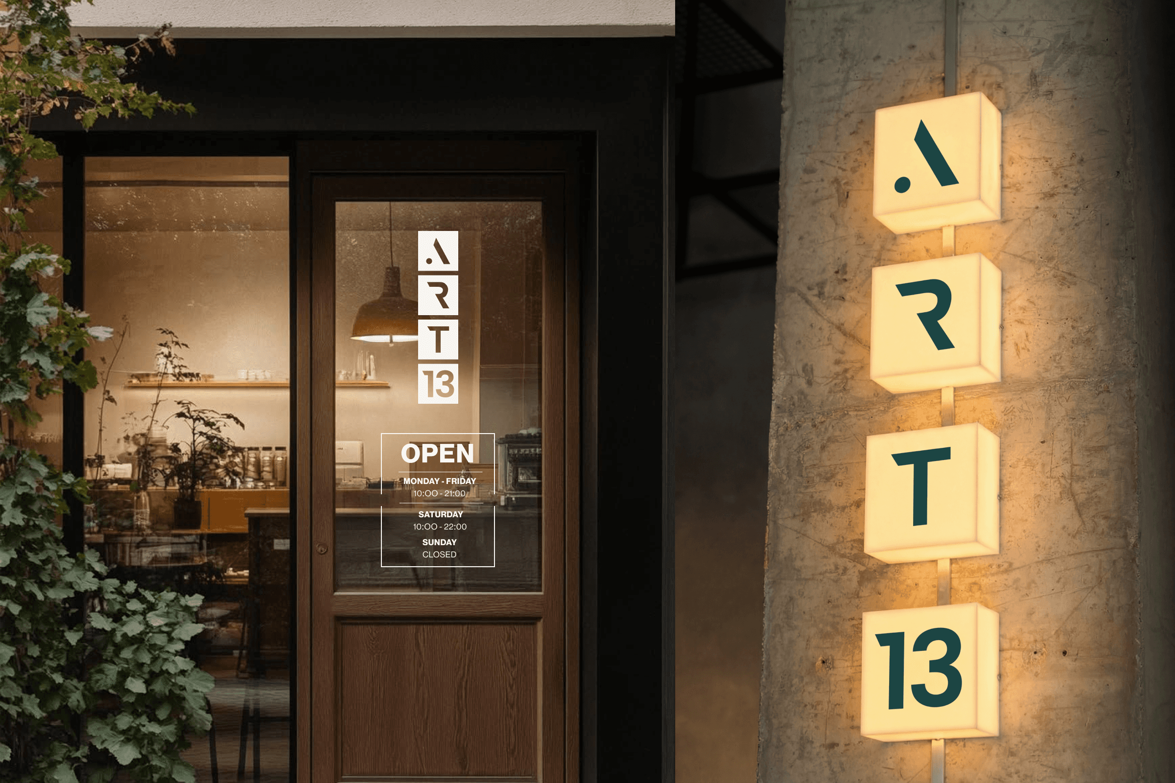
From there: a flexible logo family (primary, secondary, monogram), built to shrink to a label or scale to signage without losing itself. A nature-forward palette with one deliberate accent, so it read premium and quiet, never loud or "marketed." A tone of voice (curated, artful, future-forward, inviting), because the words carry the brand once someone else is writing the menu copy.
Application
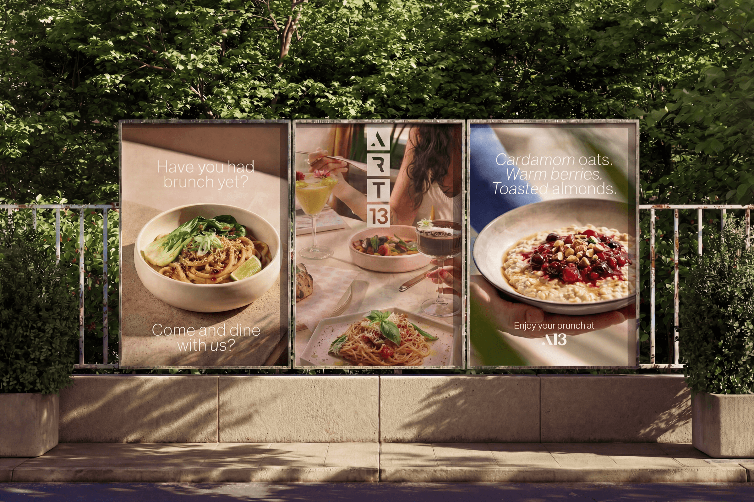
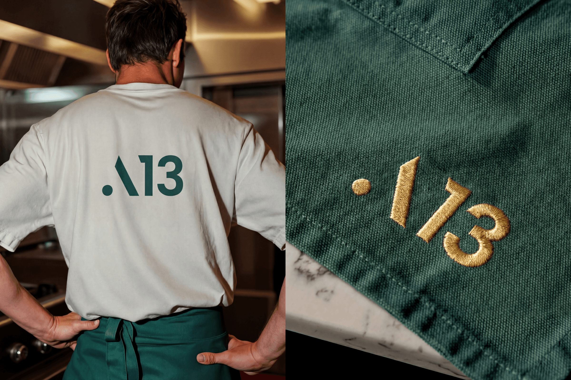
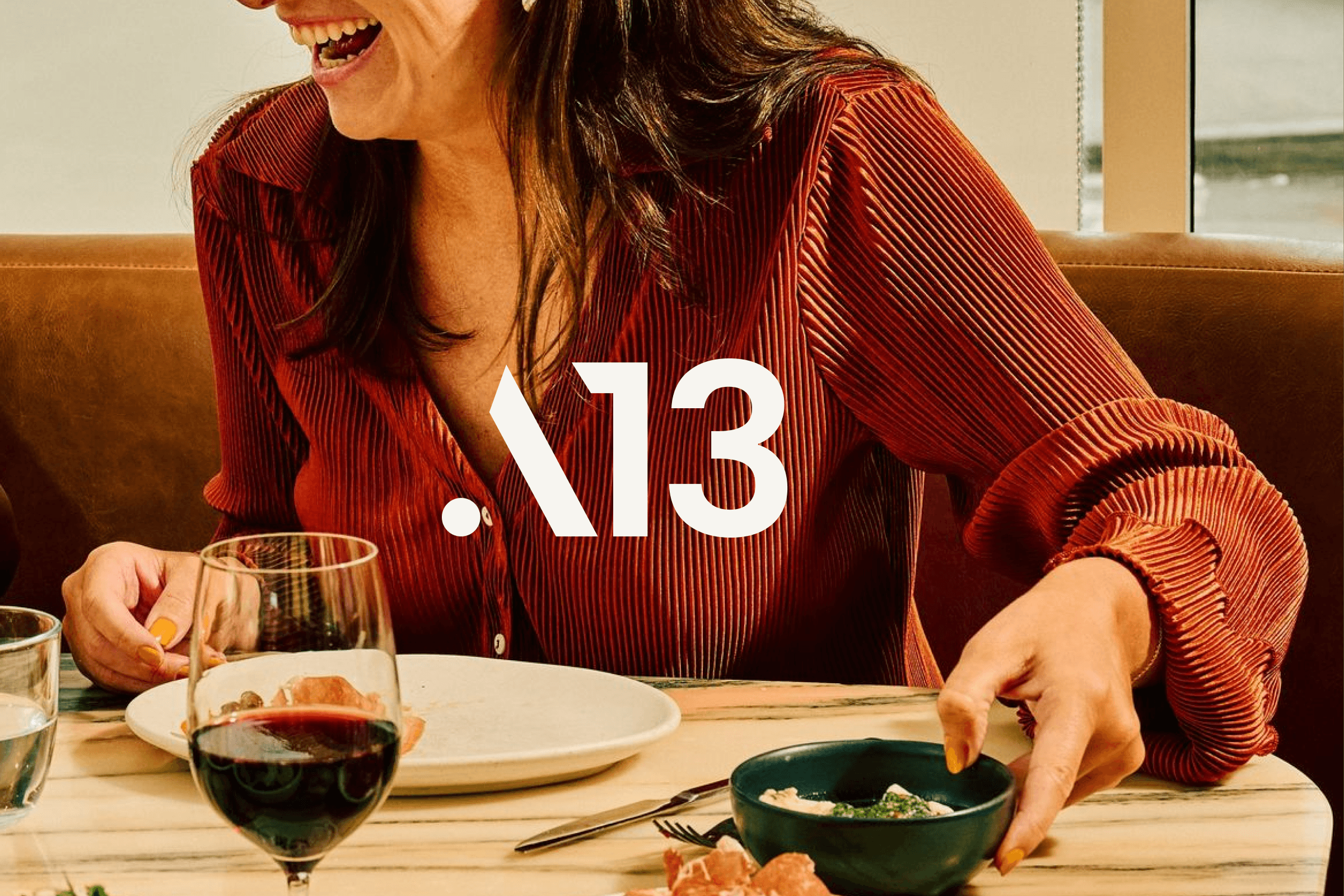
That toolkit had to prove itself across signage, packaging, menus, and social. See it applied across the gallery below.
Outcome
The system has since run across multiple concept rotations and outside collaborations without breaking or needing a rebuild. That's the exact test the brief set. ART13 still reads as one brand, no matter what's on the menu that month.
role
Art Director, Brand Designer
timeframe
6-7 WEEKS
tools
Photoshop, Illustrator & Figma
category
Brand System
year
2025
01

02
03
04

05

06

07
08

09

010
011
012
013
see also