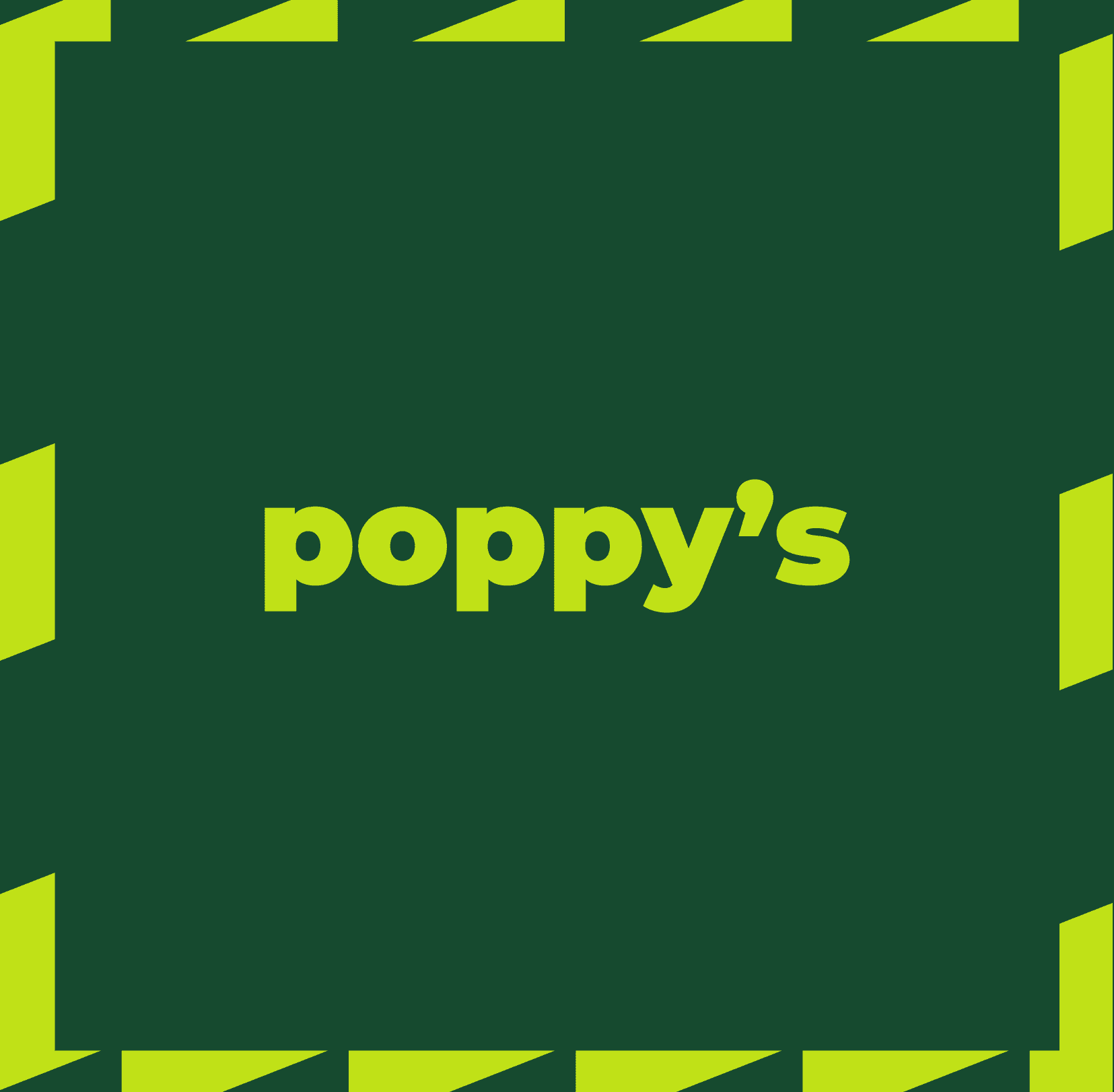
poppy's airport brand
A high-visibility airport food brand that signals fast + fresh
00

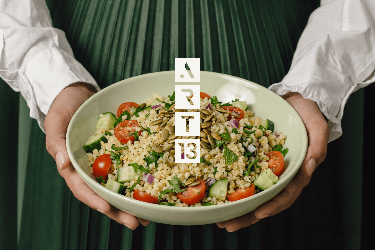
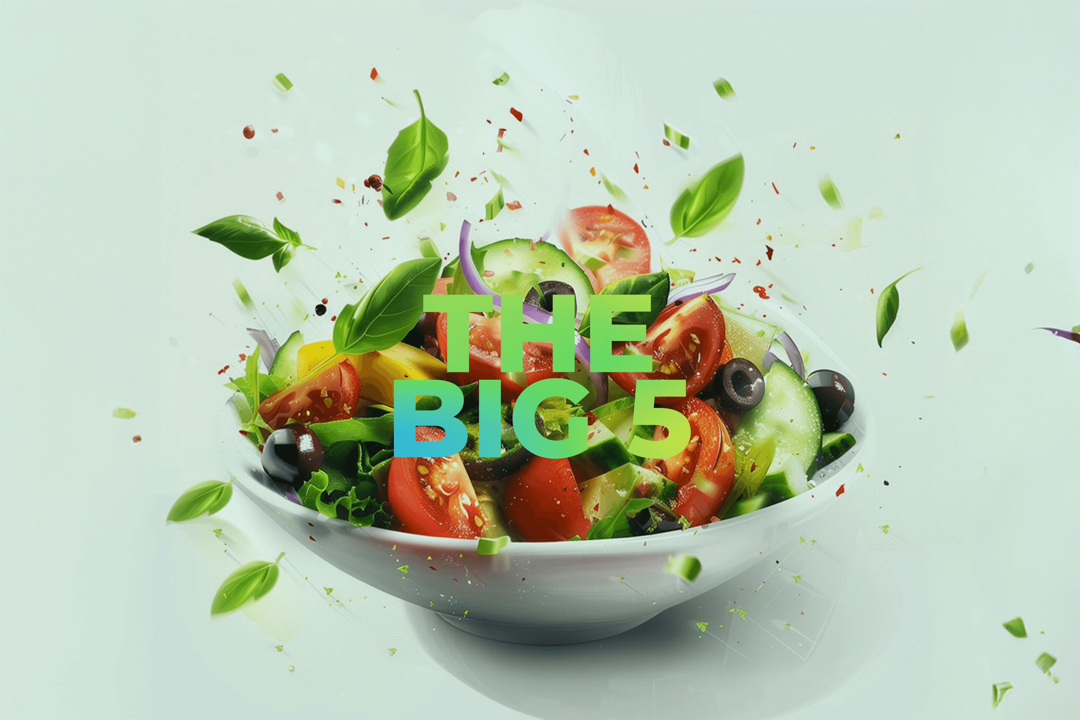
I created a new airport-facing food brand concept for GoodBytz: Poppy’s, a fast, fresh, chef-designed bowl brand built for a 24/7 robotic kitchen environment.
The challenge was to make “robotic + healthy” feel human, joyful, and trustworthy at first glance while communicating speed, hygiene, and consistency without sounding technical.
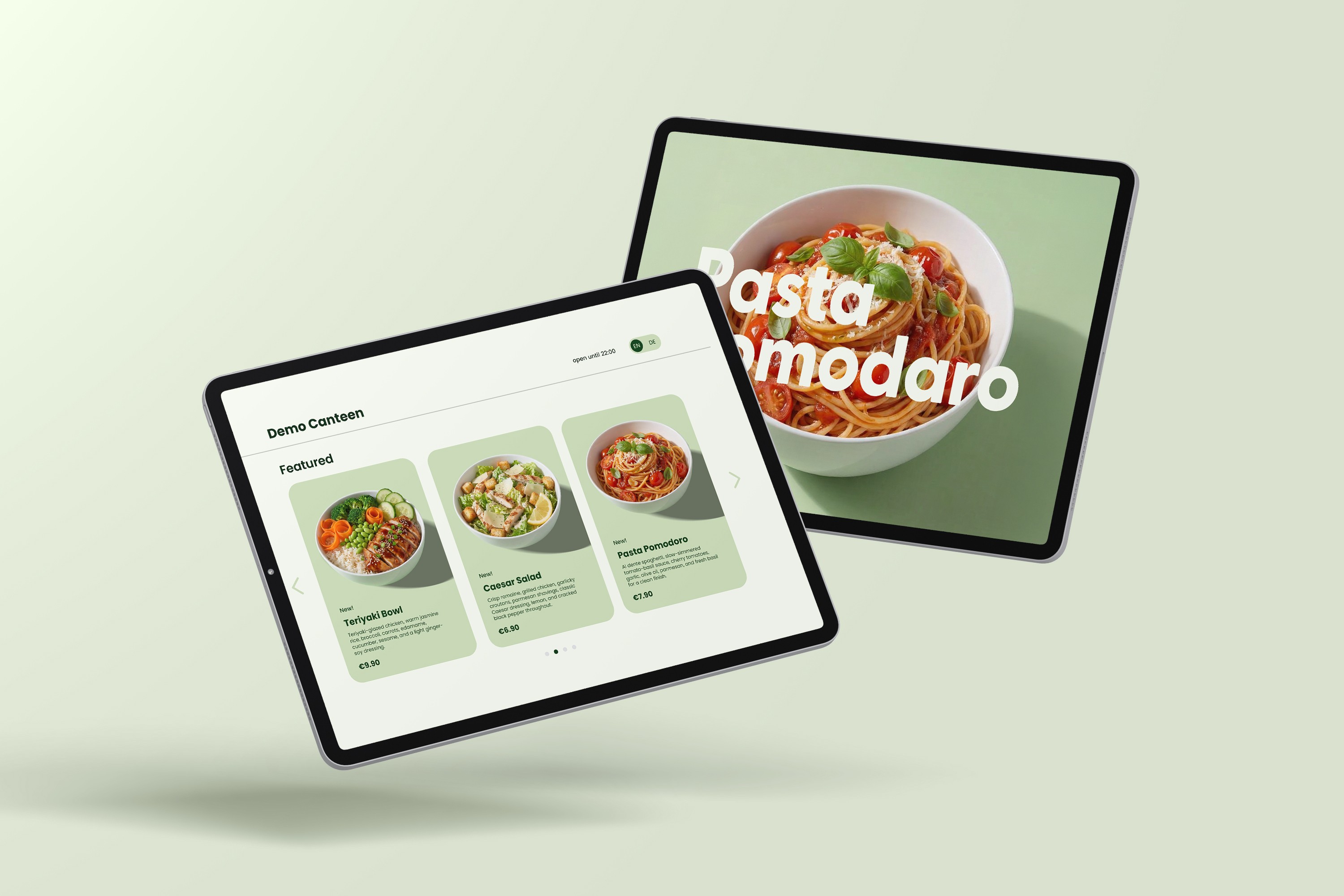
I delivered a compact brand system: name + positioning, visual identity, tone of voice, color + type system, graphic pattern language, and a set of airport-ready applications (kiosk wall lightboxes, menu boards, robot/kiosk branding mockups).
This project started from a straightforward observation in the airport context: people don’t want to “explore a brand” when they’re rushing they want certainty. My goal was to create a concept that could win attention in motion, reassure travelers instantly, and still feel like something you’d genuinely want to eat: fresh bowls with personality, not another sterile “tech food” proposition. Creatively, “success” meant building a system that works like a toolkit strong enough for wall-scale branding, flexible enough for rotating bowl photography and menu content, and consistent enough to repeat across terminals. Strategically, it had to bridge both worlds: chef credibility and robotic reliability so the brand feels joyful and human, while the operation feels precise, safe, and always on.
year
2025
timeframe
7 days
tools
Illustrator, Photoshop and Figma
category
Brand System
problem
Airport food often fails on the basics: limited hours, long queues, pre-packed meals that feel stale, and inconsistent quality across outlets. For health-conscious or allergy-sensitive travelers, trust drops further when ingredients and nutrition are unclear. In this context, GoodBytz needed a brand that could clearly signal “fresh, fast, hygienic, always available” and do it in seconds, at kiosk distance, without over-explaining the robotics.
solution
I built Poppy’s as a bright, confident, chef-led food brand that makes automation feel like a benefit not the headline. The system uses bold color blocking to cut through the visual noise of terminals and retail corridors, staying readable from distance while signaling freshness and appetite in a place where most choices look beige, backlit, and generic. The forward-facing zigzag pattern acts as a simple motion cue capturing the energy of travel, guiding the eye toward the kiosk, and reinforcing the brand position: fast, fun, and fresh, built for people in motion. Together, color + pattern create a high-visibility, high-recall identity that holds up across wall lightboxes, menu boards, and kiosk surfaces so the brand stays clear even at peak footfall and peak speed.
01

02

03

04

05

06

07

08